Beans + Buns UX Journey
Coffee Shop UX/UI Project
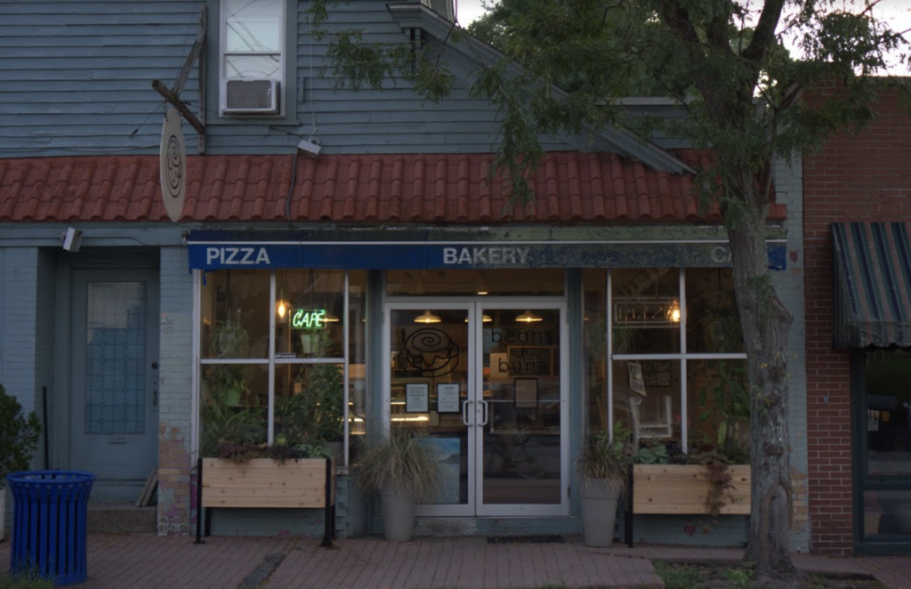
UI refers to the screens, buttons, toggles, icons, and other visual elements that you interact with when using a website, app, or other electronic device. UX refers to the entire interaction you have with a product, including how you feel about the interaction.
This UI/UX coffee shop project consisted of us choosing a coffee shop to rebrand. We had to experiment different user-centered designs. I chose Beans and Buns because I love the coffee shop and I live near by. The work began with research about the content audit, target persona, and whitespace analysis. When completing each assignment, It gave me better insight on how the User experience helped Beans+Buns with the potential to become a better brand.
Commercial Coffee Competitive Content Audit
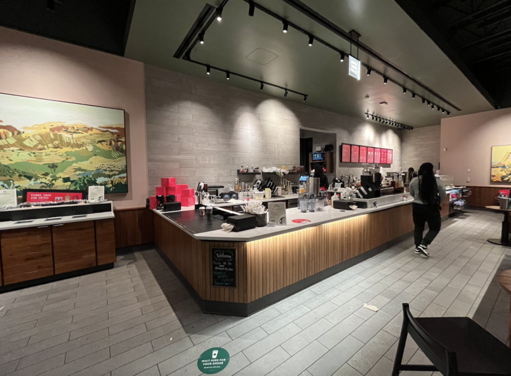
Our due diligence required us to go inside and take pictures of two different Starbucks locations and two different Dunkin’ locations to see how way finding was distributed in different coffee shops. For this re-branding strategy, we completed a content audit. In the audit we observed the users, the physical way-finding design of the stores and the intentional way-finding design of the digital signage. As a class, we identified who the target persona was for Starbucks vs. Dunkin’.
Competitive Content Analysis
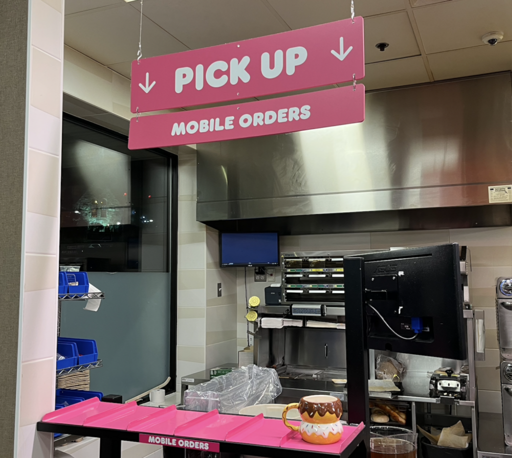
We noticed that the target persona of both Dunkin’ and Starbucks were different. The target persona for Dunkin’ consisted of older men and women staying to chat at the tables or working men getting coffee before heading off to work. The target persona for Starbucks would be more women, whether that be moms or teenage girls. The quality of their food and drinks are also very different. At Dunkin’ you would get a drink; mainly coffee in normal sizes (small, medium or large) with breakfast and snacks which appeared to be less expensive. On the other hand at Starbucks they have different names for their drink options (tall, grande, venti or trenta) with a select few snacks. Dunkin’ has a bigger menu for food than Starbucks but Starbucks seems to be a lot more overpriced. The vibe of Dunkin’ is for people who want to get their drinks/food and leave, they are usually on their way somewhere and do not want to hangout. But, Starbucks is a totally different vibe. You would find people hanging out there, chatting with friends or doing homework. Starbucks has a more comfier vibe, with dim lighting and comfy seats. While Dunkin’ has bright lights and wooden chairs.
Target Coffee Shop Content Audit
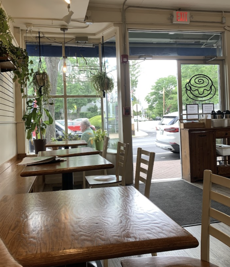
Once we completed the commercial coffee shop assignment, we took what we learned and put it into our own coffee shop that we had chosen. The target persona for Beans+Buns would be a tie between families, usually a mom, dad and kids. Or it would be tailored to younger adults, male or female. The quality of their coffee shop, is very good. With a wide range of drinks and food you can find anything you’d like there. Their drinks come in all different sizes (small, medium or large) and they also have breakfast and lunch dishes as well. The vibe of Beans+Buns would be comfy and cozy. They have got a place where you order up front and comfy seats inside and outside, in the warmer weather. Customers will either stay and chat or grab something on the go. It is a quiet atmosphere to hang out and do homework for school or chat it up with friends or family.
Target Persona

The target persona for Beans+Buns consists of families, usually a mom, dad and kids or it would be tailored to younger adults, male or female. If they were to open later than 2 o’clock everyday or open for dinner, the target persona would change. The new target persona would consist of older men or women coming back from work, looking for a place to grab dinner on their way home.
Target Whitespace Analysis
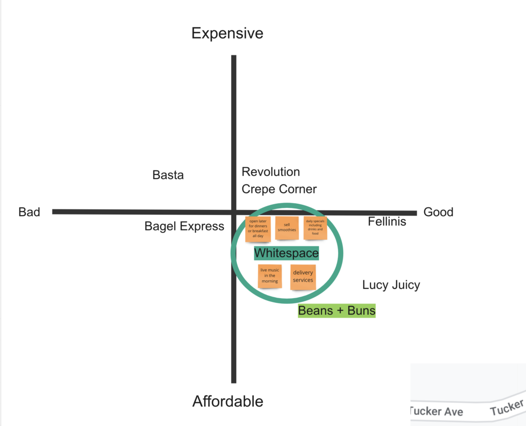
The target whitespace analysis gave us a closer look into the area in which the coffee shop resides. I realized that there is a lot of competition in the specific area and how we can improve it. We began by seeing what other coffee shops and restaurants are in the area and what they have to offer. My suggestion would entail Beans+Buns should start opening later on the weekends, they could include dinner specials and have breakfast served all day. That’ll bring in new customers or regulars and gain more money for the company. It’ll also make Beans+Buns stand out from the competition because some places in the area do not offer that. They could also have live music, whether that be in the morning for breakfast or for a dinner time special. This will lure in music lovers and new customers. Lastly, the could add a few new specials to the menu monthly. They could try out new items and if it goes well and customers like it they could eventually add that to the menu as a regular item.
Target Value Prop Canvas
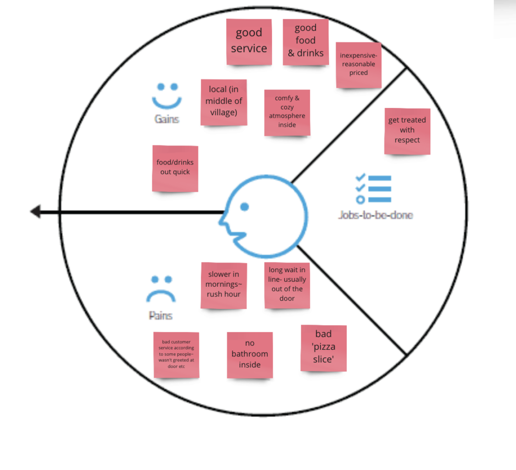
The target value prop helped us summarize why a customer would choose to eat at Beans+Buns. The target value prop communicates the benefit that the customers receive by going to this coffee shop. By doing this diagram, It helped better understand what we could work on/change and the good things that are coming out of this coffee shop. When completing these few assignments, It helped me create a new target value proposition.
Target Value Prop Analysis
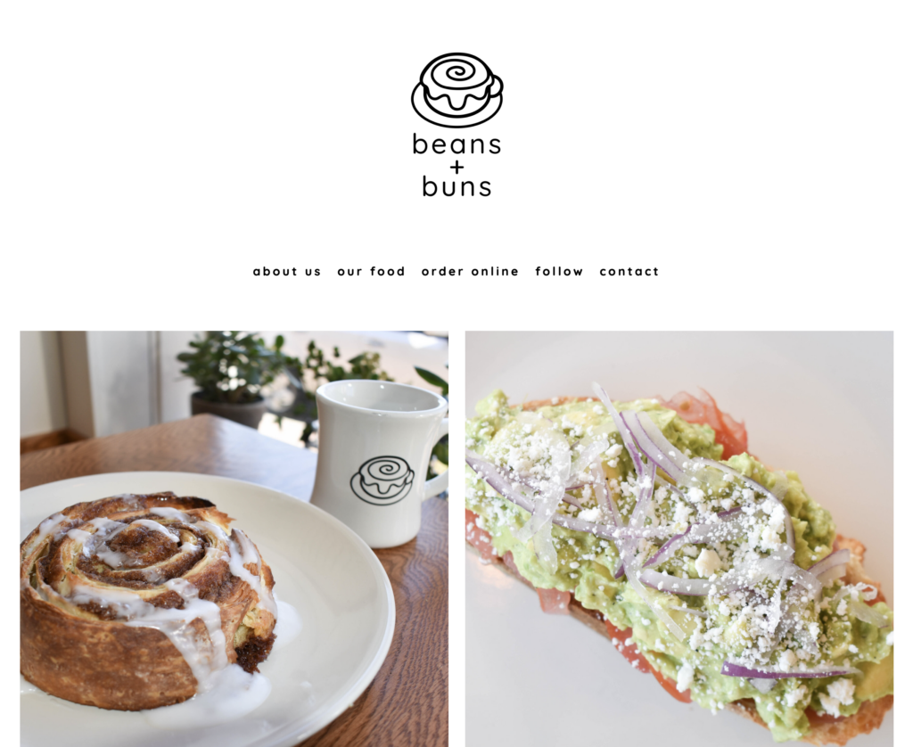
Beans+Buns had no value proposition, so it was up to me to create an amazing one for this coffee shop. The first value proposition I had come up with was “Good Coffee, Good Food”. It fit the vibe but felt a little plain. After doing more research I came up with a new value proposition, “Family & Friends Meets Good Coffee & Good Food”. I tied the target persona into my new value prop because family and friends come into Beans+Buns.
Hierarchical List
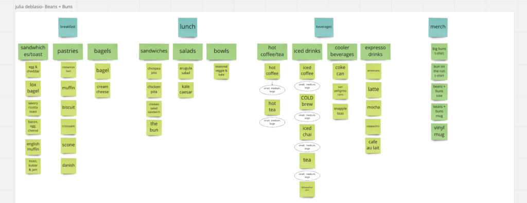
For this assignment, we took a look at the affordances. I listed all of the breakfast, lunch, beverages and merchandise items. This helped us create our next assignment which was, the mobile hierarchy website.
Target Persona Journey Map

For this assignment, we had to envision what a customer would do when opening their website and ordering something for delivery. To work on this assignment we had to pretend we were in their shoes. We had to create something that was easy to understand and follow, without the customer having too much confusion on what to do or where to go.
SWOT Diagram
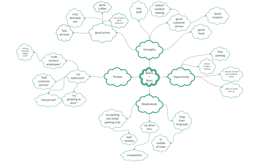
This assignment consisted of us brainstorming the strengths, weaknesses, opportunities and threats that could happen with Beans+Buns. We thought about what our company was doing well in, what opportunities the company has to make it better, the threats (coming from reviews from customers online) and what the company does poorly.
SWOT Analysis
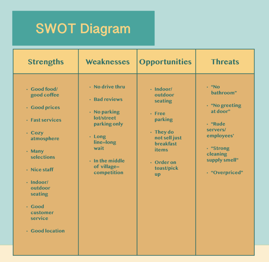
After completing the SWOT diagram, we made a table in InDesign. Making this diagram helped the User Experience and helped construct the mobile interface. I noticed that there are a lot more strengths than weaknesses, and an even amount of opportunities and threats.
Target Revised Value Proposition
Beans+Buns has more than coffee, they have different drinks, as well as food options. From doing the SWOT diagram, I noticed that a lot of good reviews mentioned their food and drinks, I wanted to incorporate that into my new value proposition. From doing the assignment about the target persona, I noticed that the people going into Beans+Buns are families and friends. That is how i came up with, “Family & Friends Meets Good Coffee & Good Food”.
Target Logo Evolutions
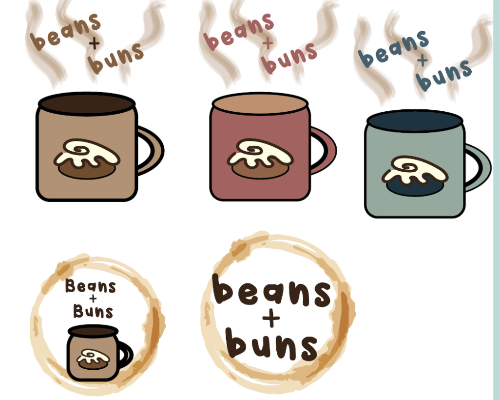
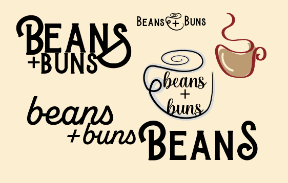
These are my ‘in-progress’ logos in illustrator. When looking at the original logo, I noticed that it was basic and needed a pop of color. I began drawing a few sketches, but none of the stood out to me. My first intentions were to create something with a mug, I tried out a few drawings and was thinking about different font styles and colors. At this point, I wanted to bring my ideas to life in Adobe Illustrator. I then proceeded to try out different colors and designs but then I changed my mind because I did not want a ‘cartoony’ look. I had switched up my whole design.
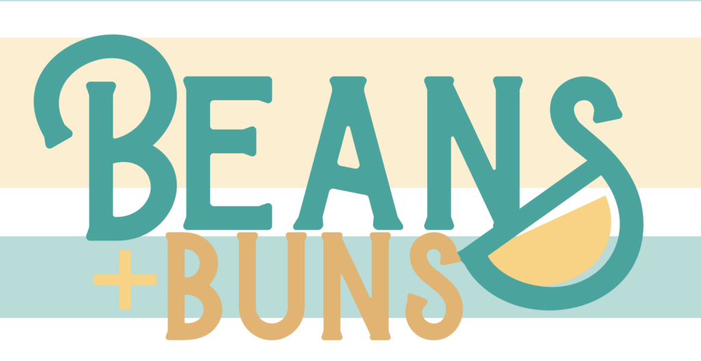
Before getting to my final logo, I tried out a few more ideas. I decided to go with the logo that stood out to me the most. The font is called Burtons and I added a “S” glyph at the end. I made the “S” look more like a coffee cup. I decided on these colors because teal means calming; beans+buns gives off a calm vibe once inside. I also added two different shades of yellow. Yellow symbolizes happiness and friendship, friends and families come into beans+buns coffee shop for good coffee and food.
Target Logo Merch
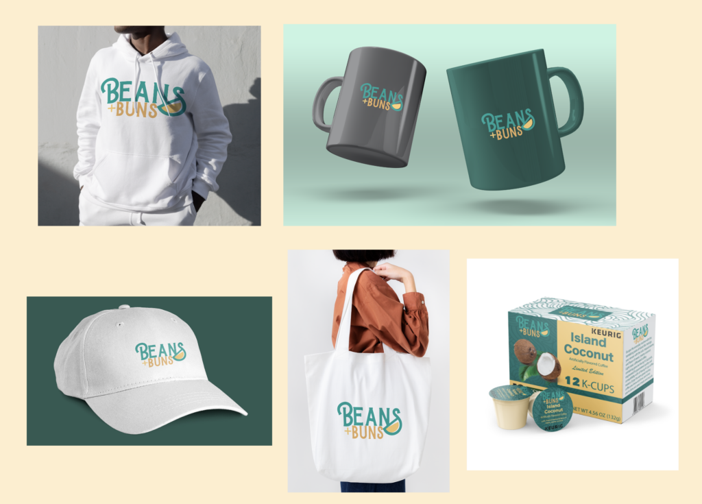
Once we finished up with the finalized logo and colors, we moved on to creating mock-ups. Beans+Buns already sells merchandise, such as sweatshirts, t-shirts, mugs, tote bags and hats. So I wanted to recreate them with the new and improved logo. For the last mock-up we had to complete, was a Keurig coffee box. We had to incorporate the colors that we used in the logo, on our box as well as similar font choices.
Target Mobile Website Wireframe
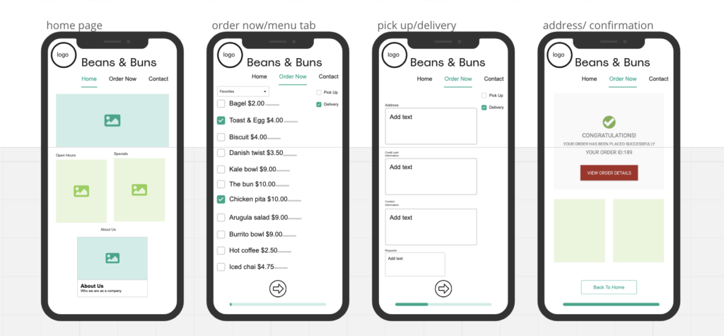
We created the mobile interface website based on the target persona journey map and SWOT analysis. This takes you through the process on what to do when ordering for delivery through the Beans+Buns website.
Target Mobile Website Prototype
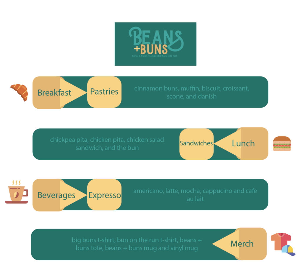
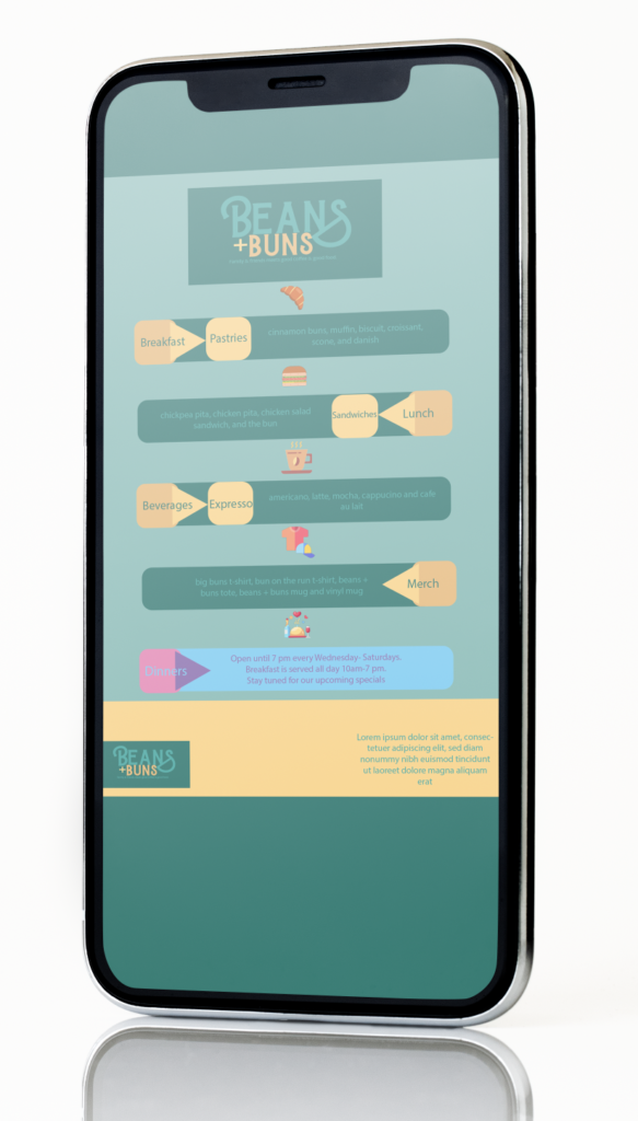
This is an image of what the user would see after they click on the Beans+Buns website. This shows them the menu and if they want to do a pick up or delivery order, they will have easy access to do so.
