The Converters Logo
Empathize
What is the project?
A new rock band called “The Converters” wants a new band logo identity.
When was the deadline?
March 13th, 2023.
Who is the audience?
The band’s audience is a range of people 25-60 that are into classic rock, blues and biker music.
What is the key fact?
An easy to visualize symbol for the band, that is similar to Guns N’ Roses.
What are the objectives?
They most important objectives would be to be an easily recognizable visual that identifies with the name of the band. Also, It should easily support and display the band website and it should look good and effective in color and in black and white.
Budget?
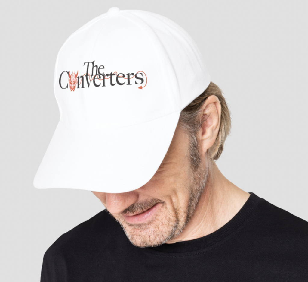
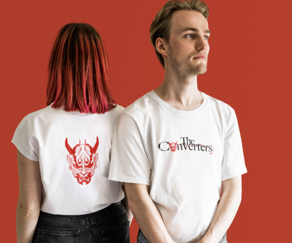
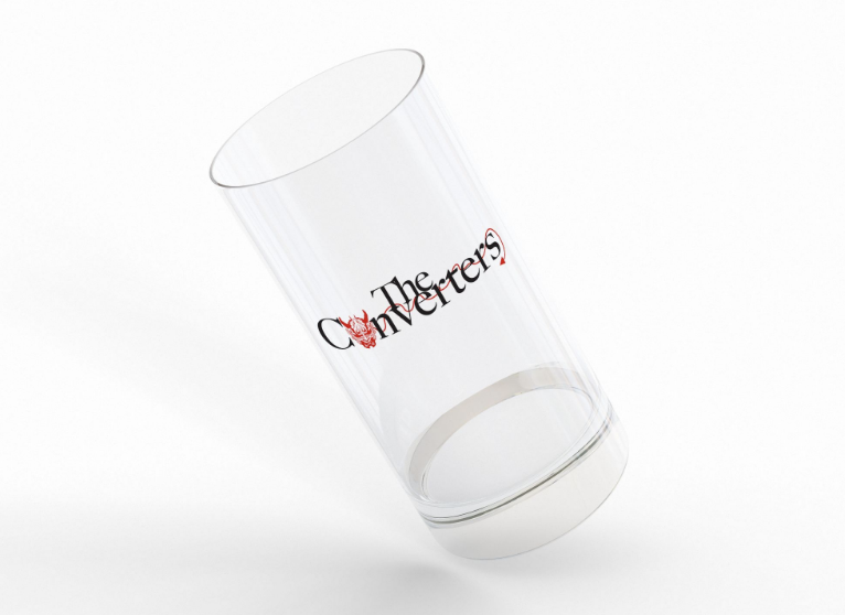
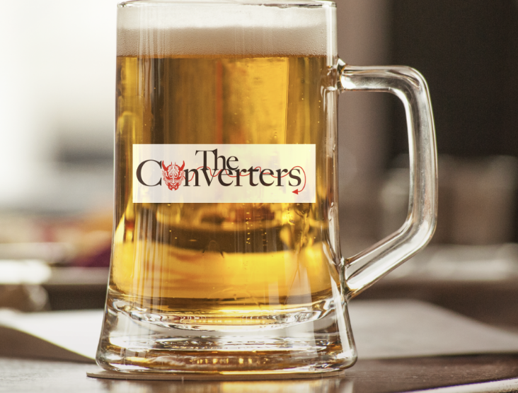
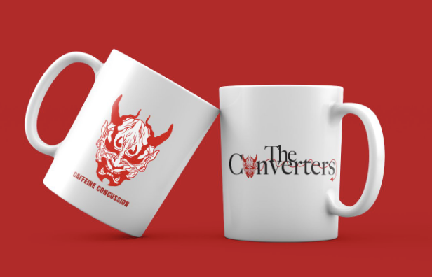
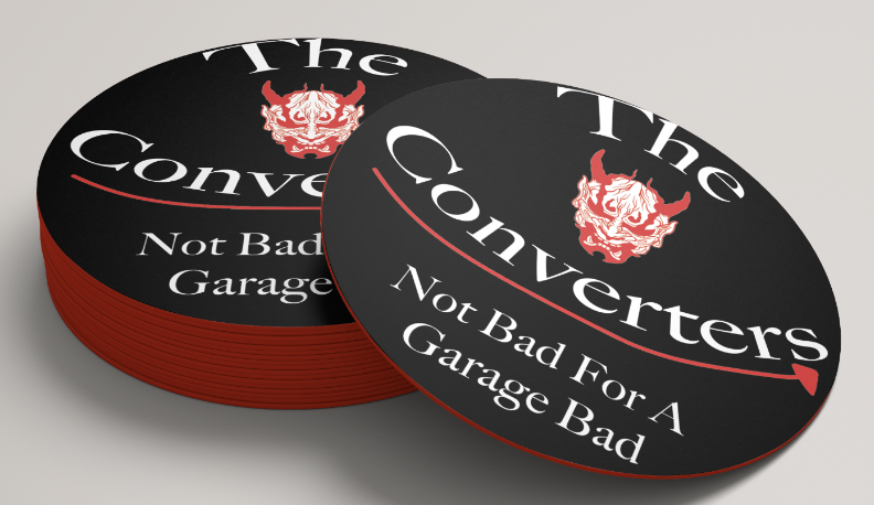
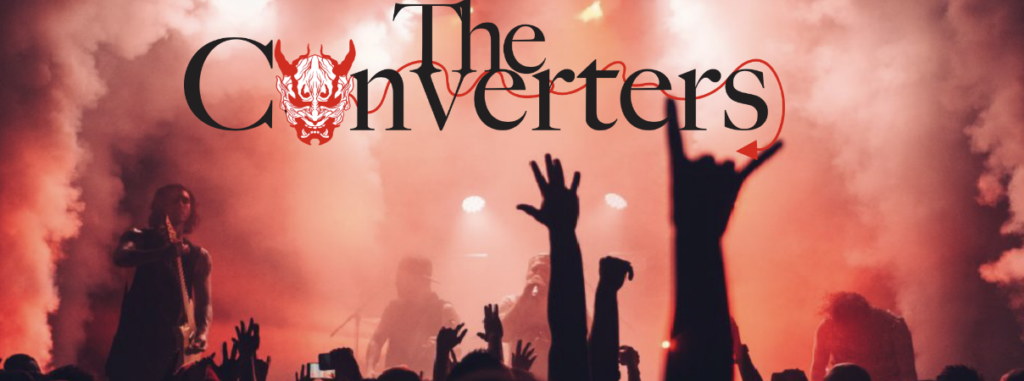
They have a budget of $650 to create some mockups like a hat, t-shirt, shot glasses, coffee mug, beer mug, coasters, and social media headers.
Logo Sketches
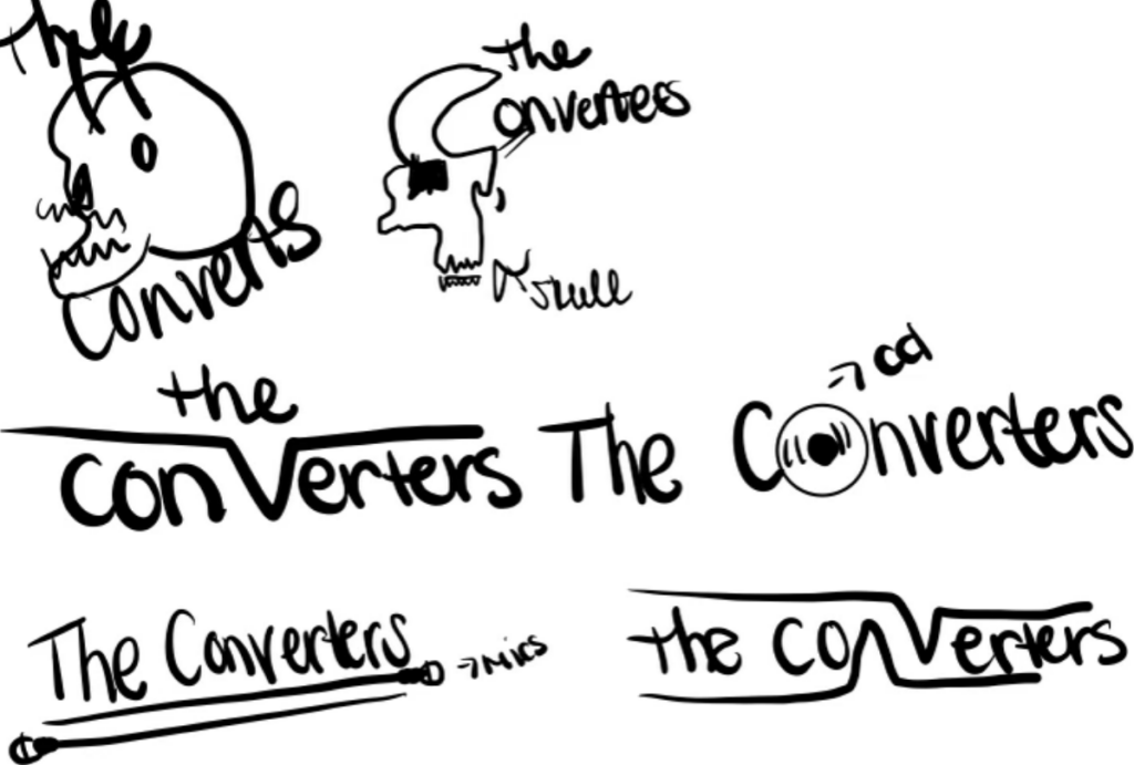
From sketching, we have to finalize two sketches.
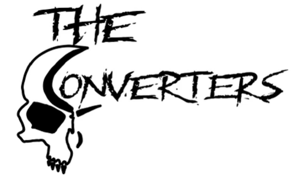
Finalized Logo
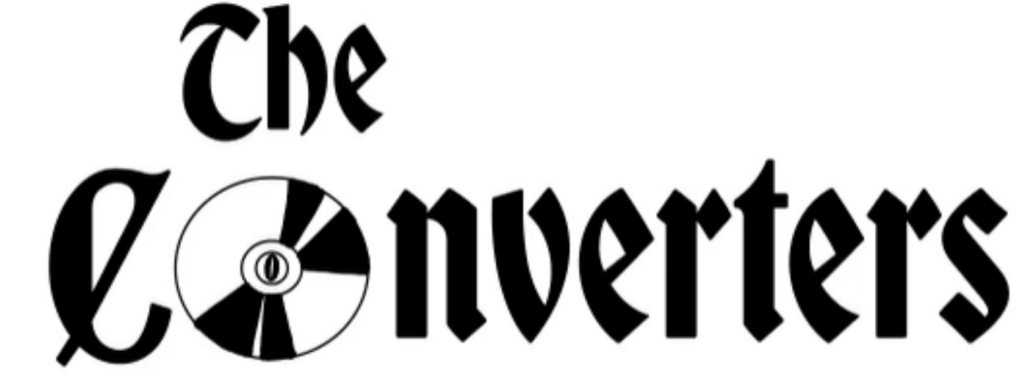
We then were advised to either create a new final logo or work with the same one and finalize it. I chose to restart. I had gone with the first logo with the skull, but it did not fit any of the criteria according to my fellow peers.
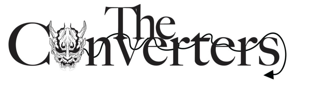
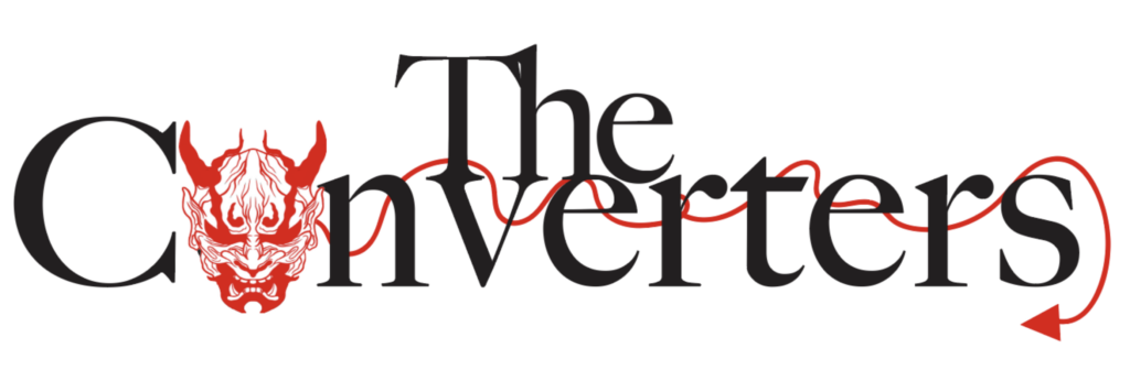
I liked the logo I first created, but I wasn’t in love with it. I decided to completely restart with a new creation. I wanted it to be simple, with a more simple font and a cool design. With my first logo it just had a random font with a skull towards the left of it, but it felt displaced. With this newer logo, the devil tail is laced throughout the bands name and the devil/skull is incorporated in the “o”. I have played with the color red as a devil is usually colored, although I still have time to figure out the color palette.
Define
Persona
The persona for “The Converters” would be any middle aged man or woman that likes similar music to rock, blues or biker style music.
Decisions
Some decisions I had to make were to completely remake my logo. I also had to rethink on color choices, layout and style for various mockups. For example, for the coaster mockup I changed the font color to white because It just looked more appealing. Although, my other logo mockups were with a black font.
Challenges/ pain points
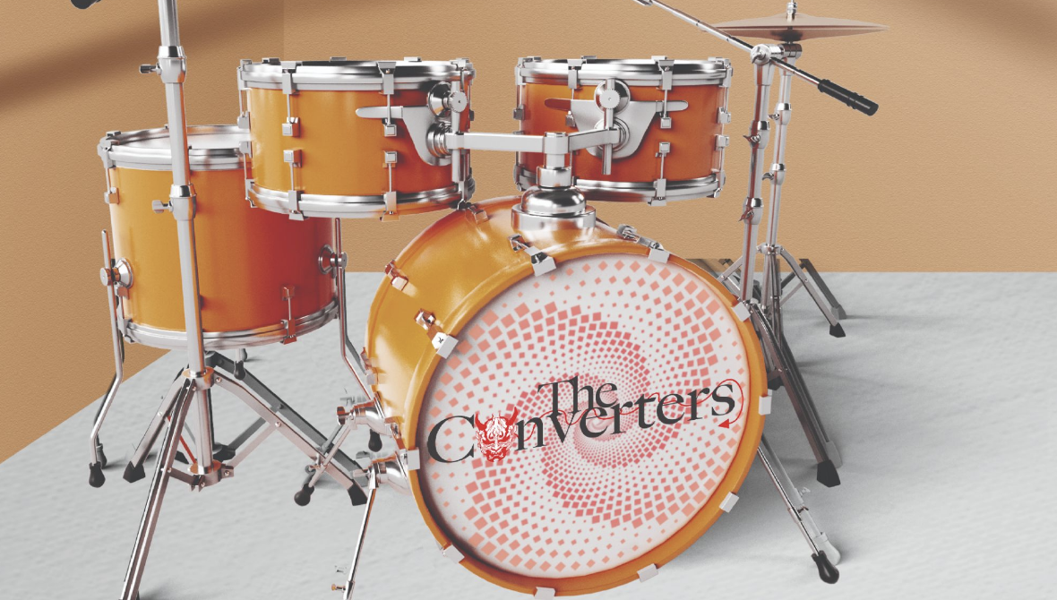
One of the main challenges I dealt with would be be to turn the first logo into something better. My first logo was just okay and I thought it would be better to start from scratch as well as adding some color into it. Another challenge I encountered was, to try and perfect the logos on the mockups as best as I could. The one that I had most difficulty with was the Youtube channel cover. We were encouraged to find a ‘drum set’ mockup, I could not find one so I had to complete some extra work. Furthermore, I ended up erasing what was inside of the drum set to create a blank space, incorporating my logo inside, but with that I had to stretch it to make it fit on an angle, I also wanted to create a nice looking background. This was one of the biggest challenges and it was very time consuming, resulting on working one hour and 15 minutes.
Ideate
Sharing Ideas
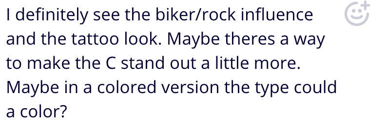
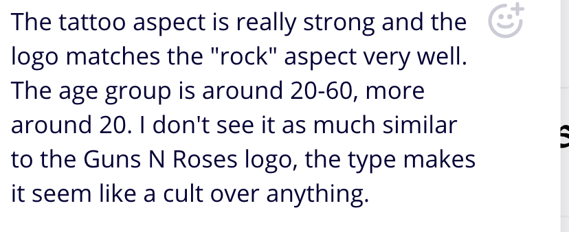
In the beginning stages of the logo design, we did a peer critique on Miro. On the first sketches here are some comments my peers have said. After reading those comments, I decided to change up the whole logo.
Prototype
Mockups
We had to take the polished logo and render a professional prototype of a hat, t-shirt, shot glass, beer mug, coffee cup, coasters and social media headers.